
Matplotlib vs Plotly (with embeded graph)
import pandas as pd
import numpy as np
import matplotlib as mlp
import matplotlib.pyplot as plt
import seaborn as sns
Data preparation
df = pd.read_csv("Dataset.csv")
#df = pd.read_csv("eLearning_Employee_Satisfaction.csv")
df
| YEAR | MONTH | Content satisfaction | Experience satisfaction | Target | |
|---|---|---|---|---|---|
| 0 | 2019.0 | AUG | 78 | 75 | 85 |
| 1 | NaN | SEP | 78 | 72 | 85 |
| 2 | NaN | OCT | 77 | 72 | 85 |
| 3 | NaN | NOV | 76 | 71 | 85 |
| 4 | NaN | DEC | 75 | 73 | 85 |
| 5 | 2020.0 | JAN | 74 | 71 | 85 |
| 6 | NaN | FEB | 72 | 70 | 85 |
| 7 | NaN | MAR | 70 | 68 | 85 |
| 8 | NaN | APR | 73 | 73 | 85 |
| 9 | NaN | MAY | 80 | 80 | 85 |
| 10 | NaN | JUN | 80 | 79 | 85 |
| 11 | NaN | JUL | 81 | 80 | 85 |
df.loc[0:4, "YEAR"] = 2019
df.loc[5:11, "YEAR"] = 2020
df[["YEAR","Content satisfaction", "Experience satisfaction", "Target"]] = df[["YEAR","Content satisfaction", "Experience satisfaction", "Target"]].astype("int")
#df.set_index(["YEAR", "MONTH"], inplace=True)
df["Period"] = df["MONTH"].astype("str") + "\n" + df["YEAR"].astype("str")
df
| YEAR | MONTH | Content satisfaction | Experience satisfaction | Target | Period | |
|---|---|---|---|---|---|---|
| 0 | 2019 | AUG | 78 | 75 | 85 | AUG\n2019 |
| 1 | 2019 | SEP | 78 | 72 | 85 | SEP\n2019 |
| 2 | 2019 | OCT | 77 | 72 | 85 | OCT\n2019 |
| 3 | 2019 | NOV | 76 | 71 | 85 | NOV\n2019 |
| 4 | 2019 | DEC | 75 | 73 | 85 | DEC\n2019 |
| 5 | 2020 | JAN | 74 | 71 | 85 | JAN\n2020 |
| 6 | 2020 | FEB | 72 | 70 | 85 | FEB\n2020 |
| 7 | 2020 | MAR | 70 | 68 | 85 | MAR\n2020 |
| 8 | 2020 | APR | 73 | 73 | 85 | APR\n2020 |
| 9 | 2020 | MAY | 80 | 80 | 85 | MAY\n2020 |
| 10 | 2020 | JUN | 80 | 79 | 85 | JUN\n2020 |
| 11 | 2020 | JUL | 81 | 80 | 85 | JUL\n2020 |
df.iloc[5,1:2]
MONTH    JAN
Name: 5, dtype: object
type(df["Content satisfaction"][0])
numpy.int64
type(df.iloc[0,0:1])
pandas.core.series.Series
plt.plot(df.MONTH, df["Content satisfaction"])
plt.show()
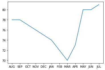
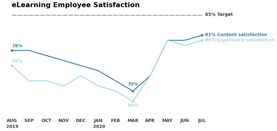
Graph with Matplotlib
x = df.MONTH
y1 = df["Content satisfaction"]
y2 = df["Experience satisfaction"]
y3 = df["Target"]

y1_color = "steelblue"
y2_color = "lightblue"
y3_color = "black"

markersize = 50
value_fontsize = 14
value_fontsize_title = 22

fontfamily = "Sans"

fig, ax = plt.subplots(figsize=(12, 6))

plt.title("    eLearning Employee Satisfaction",
          loc="left",
          pad=25,
          fontsize=value_fontsize_title,
          alpha=1,
          fontweight="bold")

xs = df.MONTH
ys1 = y1
ys2 = y2
ys3 = y3

ax.plot(x, y1, linewidth=3, color=y1_color)
ax.scatter(xs[[0, 7, 11]], ys1[[0, 7, 11]], color=y1_color, s=markersize)
ax.annotate(f"{ys1[0]:.0f}%", (xs[0], ys1[0]),
            textcoords="offset points",
            xytext=(0, 10),
            ha="left",
            fontweight="bold",
            fontsize=value_fontsize,
            color=y1_color)

ax.annotate(f"{ys1[7]:.0f}%", (xs[7], ys1[7]),
            textcoords="offset points",
            xytext=(-17, 18),
            ha="left",
            fontweight="bold",
            fontsize=value_fontsize,
            color=y1_color)

ax.annotate(f"{ys1[11]:.0f}% Content satisfaction", (xs[11], ys1[11]),
            textcoords="offset points",
            xytext=(10, -3),
            ha="left",
            fontweight="bold",
            fontsize=value_fontsize,
            color=y1_color)

ax.plot(x, y2, linewidth=3, color=y2_color)
ax.scatter(xs[[0, 7, 11]], ys2[[0, 7, 11]], color=y2_color, s=markersize)
ax.annotate(f"{ys2[0]:.0f}%", (xs[0], ys2[0]),
            textcoords="offset points",
            xytext=(0, 10),
            ha="left",
            fontweight="bold",
            fontsize=value_fontsize,
            color=y2_color)

ax.annotate(f"{ys2[7]:.0f}%", (xs[7], ys2[7]),
            textcoords="offset points",
            xytext=(-17, -18),
            ha="left",
            fontweight="bold",
            fontsize=value_fontsize,
            color=y2_color)

ax.annotate(f"{ys2[11]:.0f}% Experience satisfaction", (xs[11], ys2[11]),
            textcoords="offset points",
            xytext=(10, -3),
            ha="left",
            fontweight="bold",
            fontsize=value_fontsize,
            color=y2_color)

ax.plot(x, y3, linewidth=3, color=y3_color, linestyle=(0, (5, 1)), alpha=.5)
#ax.scatter(xs[11], ys3[11], color=y3_color, s=markersize)
ax.annotate(f"{ys3[11]:.0f}% Target", (xs[11], ys3[11]),
            textcoords="offset points",
            xytext=(10, -3),
            ha="left",
            fontweight="bold",
            fontsize=value_fontsize,
            color=y3_color,
            alpha=.75)

# ax.set_xlim()
ax.xaxis.set_ticks_position('none')
# ax.xaxis.set_tick_params(labelsize=value_fontsize)
for tick in ax.xaxis.get_major_ticks():
    tick.label1.set_fontsize(value_fontsize)
    tick.label1.set_fontweight("bold")
    tick.label1.set_alpha(.75)

plt.figtext(.1401,
            .04,
            "2019                                                 2020",
            fontsize=value_fontsize,
            fontweight="bold",
            color="black",
            fontfamily=fontfamily,
            alpha=.75)

ax.set_ylim(65, 85)
ax.set_yticks([])

ax.spines["left"].set_visible(False)
ax.spines["right"].set_visible(False)
ax.spines["top"].set_visible(False)
ax.spines["bottom"].set_visible(False)

plt.savefig("post.png")
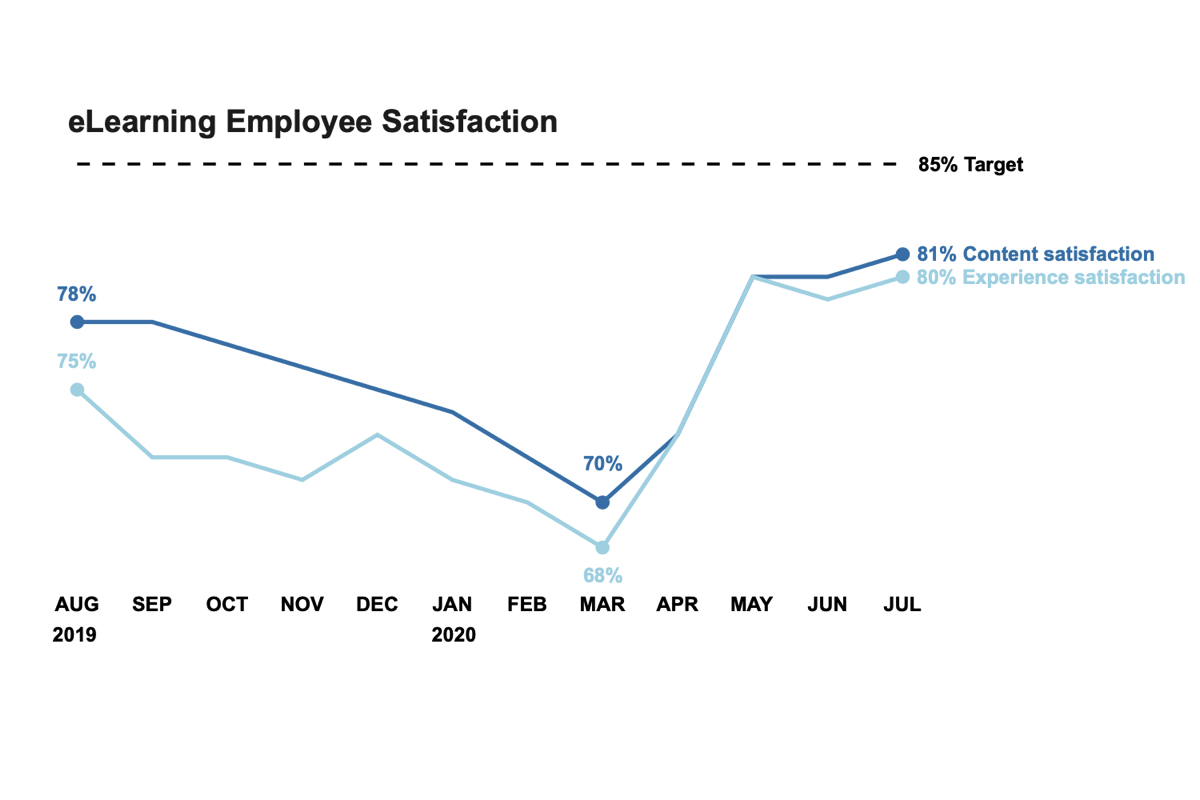
Graph with Plotly
import plotly.graph_objects as go

x = df.MONTH
y1 = df["Content satisfaction"]
y2 = df["Experience satisfaction"]
y3 = df["Target"]

y1_color = "steelblue"
y2_color = "lightblue"
y3_color = "black"

markersize = 10
value_fontsize = 14
value_fontsize_title = 22

fontfamily = "Arial"

p = [0, 7, 11]

# Create traces
fig = go.Figure()

# Trace 1
fig.add_trace(
    go.Scatter(x=x,
               y=y1,
               mode="lines",
               name="Content satisfaction",
               line=dict(color=y1_color, width=3)))
fig.add_trace(
    go.Scatter(
        x=x.take([0, 7, 11]),
        y=y1.take([0, 7, 11]),
        mode="markers",  # "markers+text"
        #name="Experience satisfaction",
        marker=dict(color=y1_color, size=markersize),
#         text=[f"{y2[p[0]]}%", f"{y2[p[1]]}%"],
#         textposition="top center"
    )
)

# Trace 2
fig.add_trace(
    go.Scatter(x=x,
               y=y2,
               mode="lines",
               name="Experience satisfaction",
               line=dict(color=y2_color, width=3)))
fig.add_trace(
    go.Scatter(
        x=x.take([0, 7, 11]),
        y=y2.take([0, 7, 11]),
        mode="markers",  # "markers+text"
        #name="Experience satisfaction",
        marker=dict(color=y2_color, size=markersize),
#         text=[f"{y2[p[0]]}%", f"{y2[p[1]]}%"],
#         textposition="top center"
    )
)

# Trace 3
fig.add_trace(
    go.Scatter(x=x,
               y=y3,
               mode="lines",
               name="Target",
               line=dict(color=y3_color, width=2, dash="dash")))

fig.update_traces(hovertemplate = '%{y:.2f}<extra></extra>')

# Annotations
annotations = []

# Title
annotations.append(
    dict(xref="paper",
         yref="paper",
         x=0.05,
         y=1.0,
         xanchor="left",
         yanchor="bottom",
         text="<b>eLearning Employee Satisfaction</b>",
         font=dict(size=value_fontsize_title,
                   color="rgb(37,37,37)"),
         showarrow=False))

# Trace 1
annotations.append(
    dict(x=x[0],
         y=y1[0],
         yanchor="bottom",
         text=f"<b>{y1[0].take(0)}%</b>",
         font=dict(color=y1_color),
         showarrow=False,
         xshift=0,
         yshift=10))

annotations.append(
    dict(x=x[7],
         y=y1[7],
         yanchor="bottom",
         text=f"<b>{y1[7].take(0)}%</b>",
         font=dict(color=y1_color),
         showarrow=False,
         xshift=0,
         yshift=18))

annotations.append(
    dict(x=x[11],
         y=y1[11],
         xanchor="left",
         text=f"<b>{y1[11].take(0)}% Content satisfaction</b>",
         font=dict(color=y1_color),
         showarrow=False,
         xshift=10,
         yshift=0))

# Trace 2
annotations.append(
    dict(x=x[0],
         y=y2[0],
         yanchor="bottom",
         text=f"<b>{y2[0].take(0)}%</b>",
         font=dict(color=y2_color),
         showarrow=False,
         xshift=0,
         yshift=10))

annotations.append(
    dict(x=x[7],
         y=y2[7],
         yanchor="top",
         text=f"<b>{y2[7].take(0)}%</b>",
         font=dict(color=y2_color),
         showarrow=False,
         xshift=0,
         yshift=-10))

annotations.append(
    dict(x=x[11],
         y=y2[11],
         xanchor="left",
         text=f"<b>{y2[11].take(0)}% Experience satisfaction</b>",
         font=dict(color=y2_color),
         showarrow=False,
         xshift=10,
         yshift=0))

# Trace 3
annotations.append(
    dict(x=x[11],
         y=y3[11],
         xanchor="left",
         text=f"<b>{y3[11].take(0)}% Target<b>",
         font=dict(color=y3_color),
         showarrow=False,
         xshift=10,
         yshift=0))

fig.update_xaxes(gridcolor="rgba(0,0,0,0)",tickfont=dict(color="black", size=14), tickprefix="<b>",ticksuffix ="</b><br>")
fig.update_yaxes(gridcolor="rgba(0,0,0,0)",showticklabels=False)

fig.update_layout(annotations=annotations,
                  autosize=True,
                  width=1000,
                  height=500,
                  showlegend=False,
                  paper_bgcolor="rgba(0,0,0,0)",
                  plot_bgcolor="rgba(0,0,0,0)",
                  font_size=value_fontsize,
                  modebar={"bgcolor": "rgba(255,255,255,0.0)"},
                  hovermode="closest",
                  xaxis=dict(
                      tickmode = 'array',
                      tickvals = [x for x in range(0,12)],
                      ticktext = ['AUG<br>2019', 'SEP', 'OCT', 'NOV', 'DES', 'JAN<br>2020', "FEB", "MAR", "APR", "MAY", "JUN", "JUL"]))

fig.layout.font.family = fontfamily

fig.show()
Exporting Plotly Graph
export the graph as a HTML page
import plotly.io as pio
pio.write_html(fig, file="index.html", auto_open=True)
Export the graph to chart studio
import chart_studio.plotly as py
py.plot(fig, filename="eLearning_Employee_Satisfaction", auto_open=True)
https://plotly.com/~lewiuberg/48/
Embedding Plotly Graph
import chart_studio.tools as tls
tls.get_embed('https://plotly.com/~lewiuberg/48')
<iframe id="igraph" scrolling="no" style="border:none;" seamless="seamless" src="https://plotly.com/~lewiuberg/48.embed" height="525" width="100%"></iframe>
The result
Info! This graph is not optimized for mobile view or narrow screens.

Leave a comment